UI Design / UX Design
My primary role was a Visual/UI Designer with a small percentage of my time allocated for various UX tasks and discussions.
When I started, we had a small but rounded UX Team with a dedicated UX Researcher, a UX Designer, a copywriter, and myself; a UI Designer. On occasion, I would find myself creating assets for the UXD and/or researcher because we were such a small team, so I might find myself creating low or high fidelity mockups and click-throughs for them... and sometimes being the one to drive the discussion and capture feedback, but again, it was a small percentage of my time.
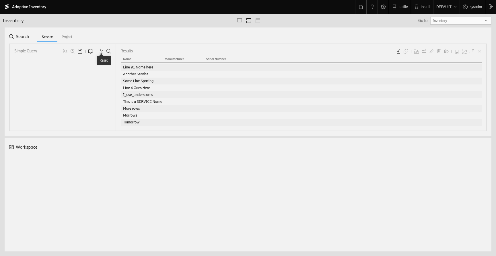
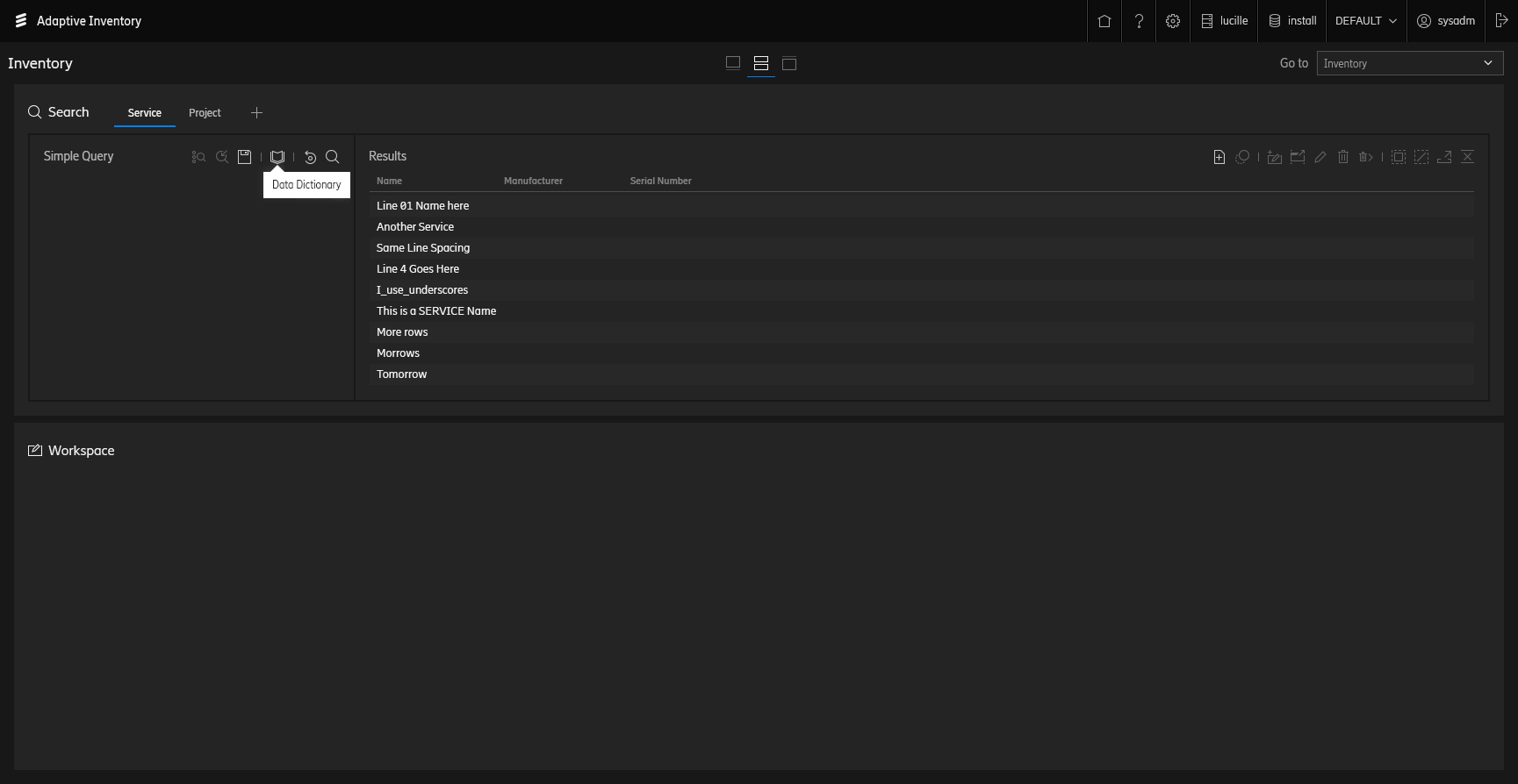
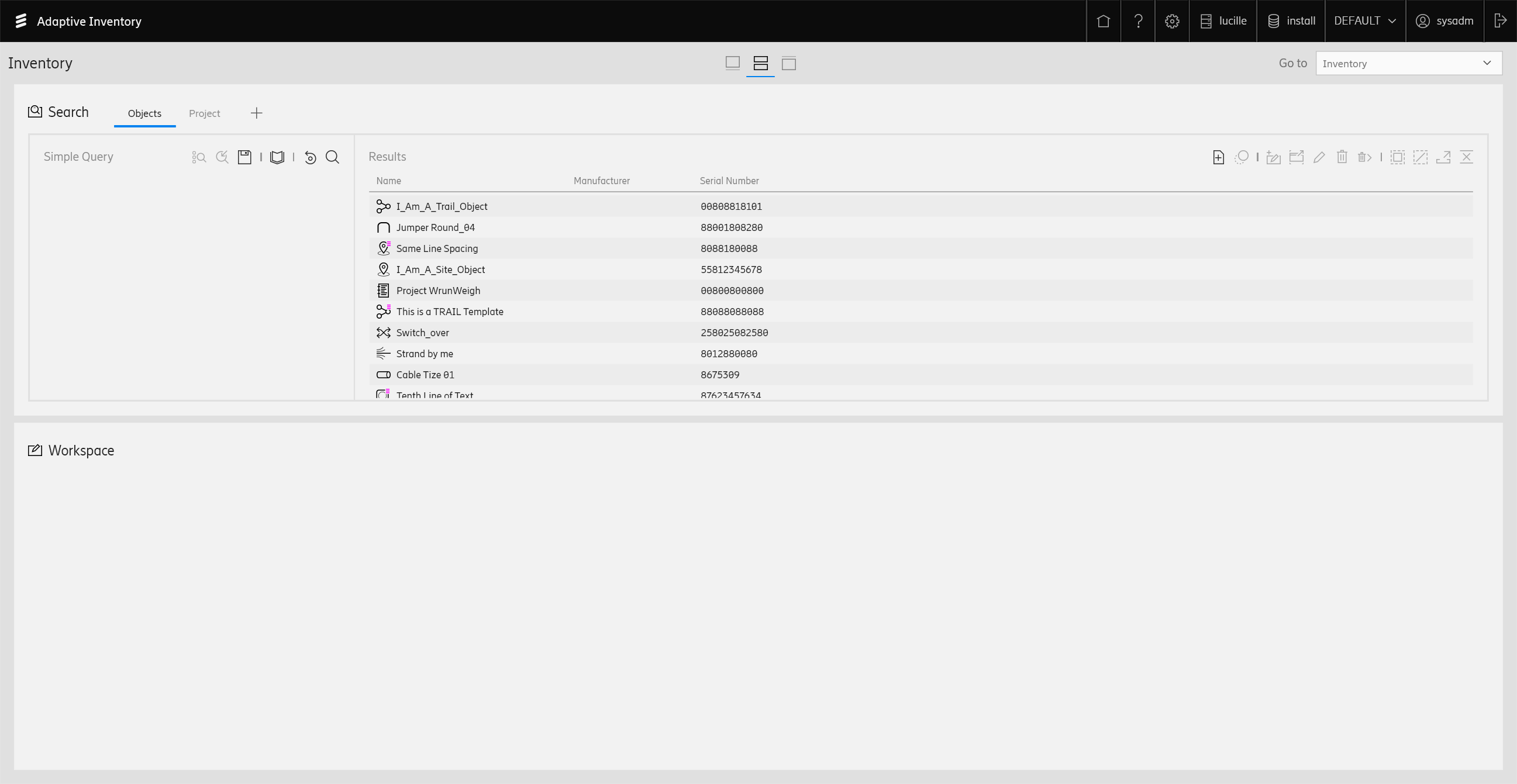
This page is just a collection of some smaller endeavors or things of interest.

This mockup demonstrates an interface where users may want to compare the viability of one element over another (or multiple) by comparison for consumption into a network trail.
Shown above is if the user had selected some ports (inventory object) and initiated the trace to compare the objects. This modal pop-up would allow the insertion of an element and it's connected objects into a trail. The traced objects are always displayed in the center column. the left and right sides show (if relevant) the "ends" of the connected object connectivity. The A and Z sides were very important in the decision of what elements were chosen for consumption - location, type, and availability assisted the user in choosing the most appropriate element to add to their trail.
The UI also shows a collapsed representation of the other network objects within the trails between the traced element (center) and the A/Z side elements, badged by a number that indicates how many objects it represents. The upper-left header of each trace row summarized the total number of connected objects that are a part of that element's trace. Multiple elements/trails may be selected and added to the resulting network trail.
As mentioned above, at times I was called-upon for high and/or low fidelity walk-throughs of potential features for various reasons; stakeholder feedback, user testing, demonstrating functionality to the development team, etc.

The linked PDF above is just a small, non-descript example of a document I created to confirm stakeholders' requirements and convey an initial solution and flow.
There is no text/visual context provided as this was meant to be a visual aid to a verbal discussion, not pervassive documentation.
While I do have a dedicated page showing some of the rebranded object icons, the majority of my icon work was under the previous branding guidelines with a slightly differen aesthetic.
Below is an example of an icon endeavor needed for a specific project. It was typical to work piecemeal to add object/interface icons to the UI as the feature entered development, so there are dozens of projects similar to this where groups of icons and variants were delivered to the teams.
One of the challenges of an ever-growing repository of object icons is that it is nearly impossible to foresee any future repurposing of visual language and allowing for an entire sub-class of icons based on a previous design.
The quick mockups below were loosely based on the then-existing design of Adaptive Inventory, but merely "re-skinned" to approximate an adoption of the more recent Ericsson branding - not of the newere UX patterns.
It was this very exploration that led me to deciding to redesign and rebrand our existing repository of object, inventory, and interface icons. The existing legacy icons felt and looked out-of-place in the more-refined UI.
When the time ever comes for the EAI suite to migrate to the new brand, it will not be a mere re-skinning, but a re-think of the UI and adoption of parent SDK controls and patterns.