UI Design / UX Design

*Due to NDA restrictions, I am unable to show finished screens from within the application(s). The following examples are pre-implementation mockups or visual representations that closely resemble the final product if implemented.
Before realizing the opportunity to jump-in and learn XAML & Expression Blend to create a live, online style guide, I was hired to create the offline style guide which I began using Adobe InDesign. The document below is a representation of the early stages of creation before migrating to an online approach.
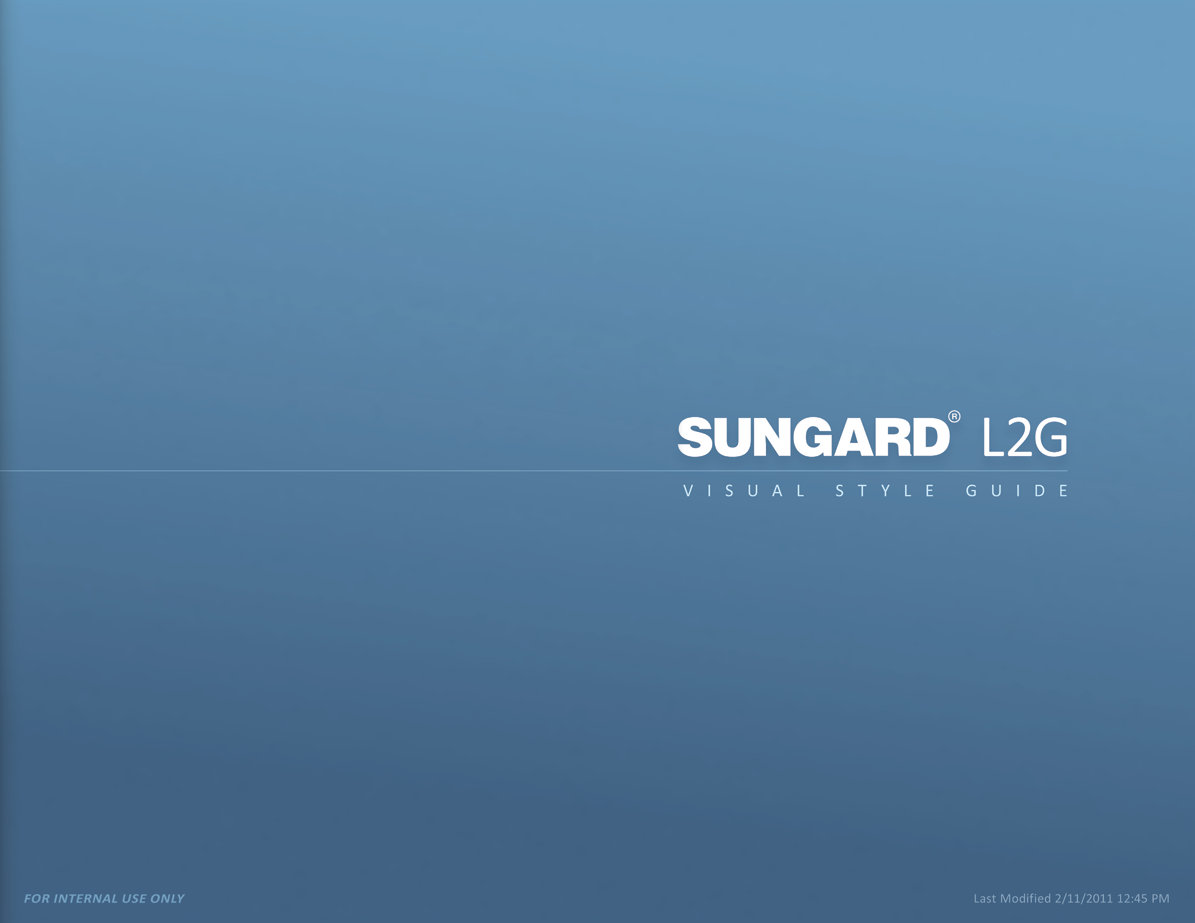
While this Style Guide is incomplete, it does give an indication of my approach to such endeavors and my attention to detail.

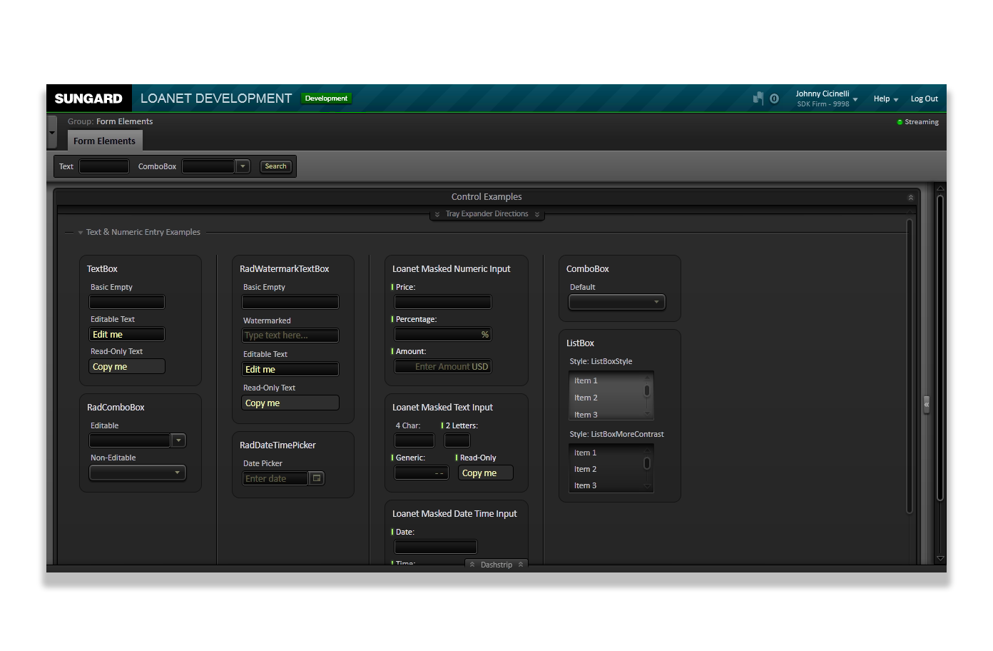
In addition to learning how to use Expression Blend and Visual Studio, another major challenge was to learn to deconstruct and reconfigure the core Silverlight controls to look and behave as we wanted, and for me to not break functionality as I progressed.
Learning how to work-around the back end code and to re-appropriate the bindings so as not to break them allowed me to work "live" on production pages and reverse flow the results into the Style Guide.
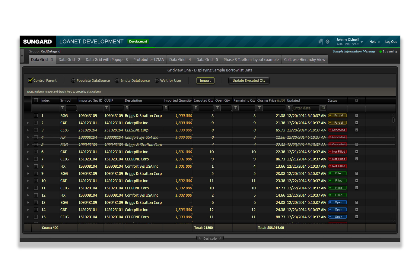
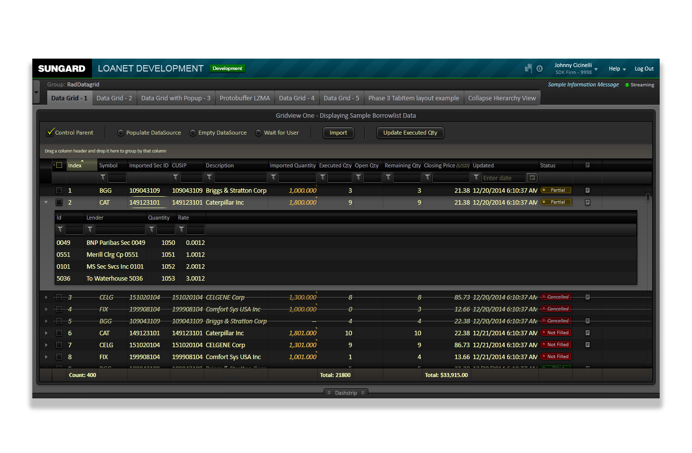
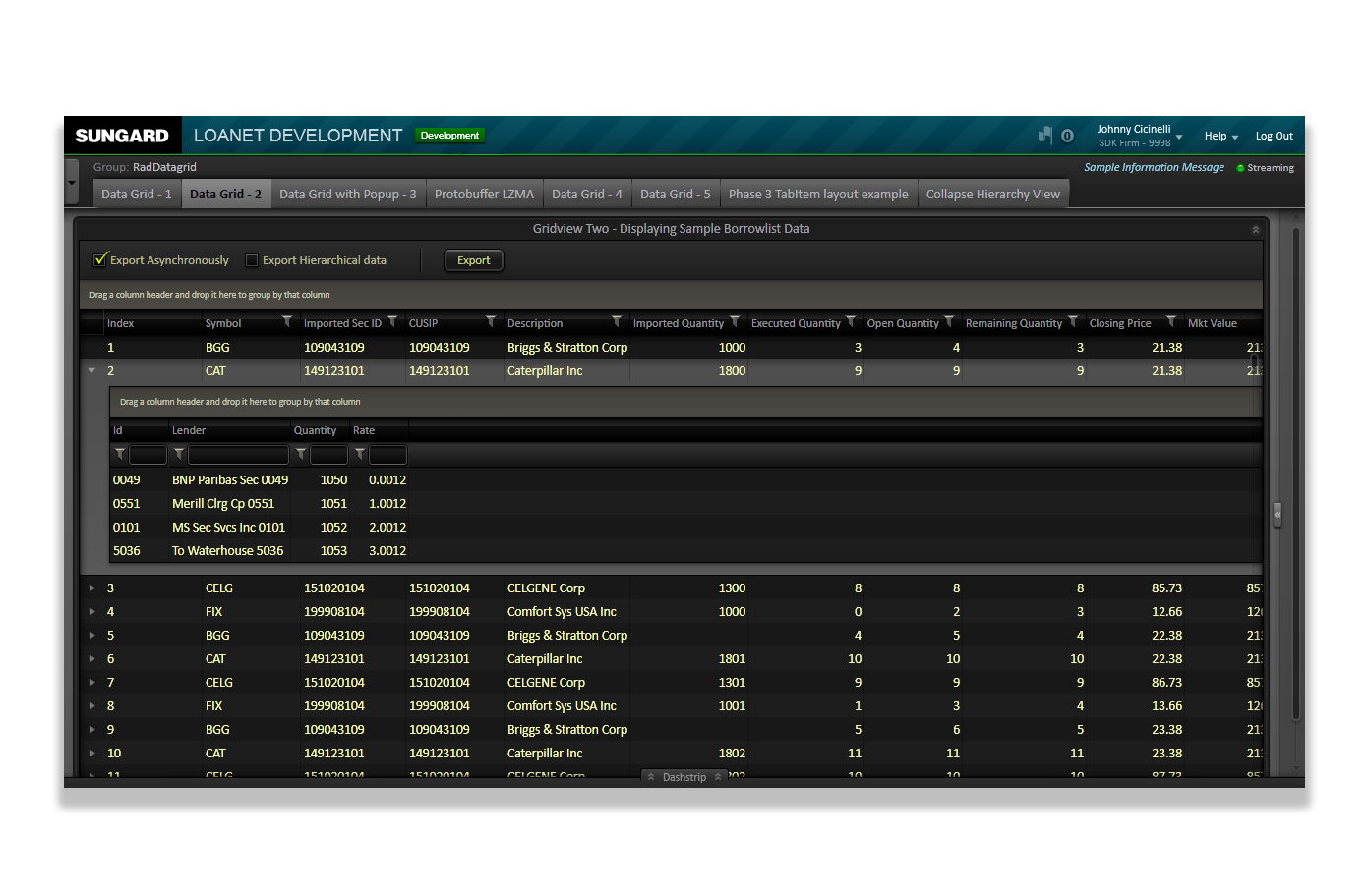
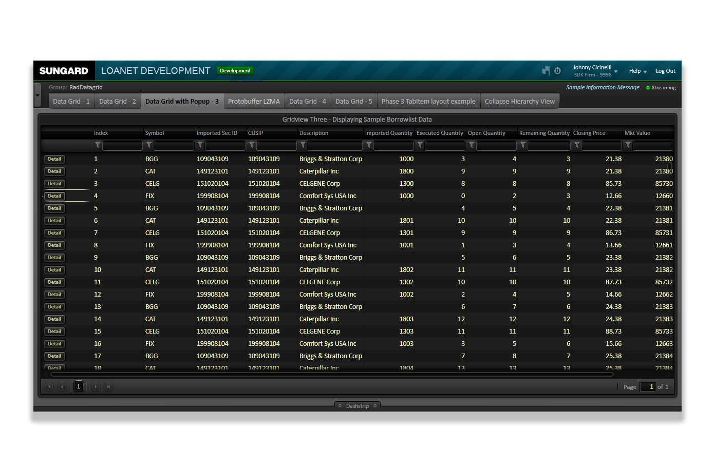
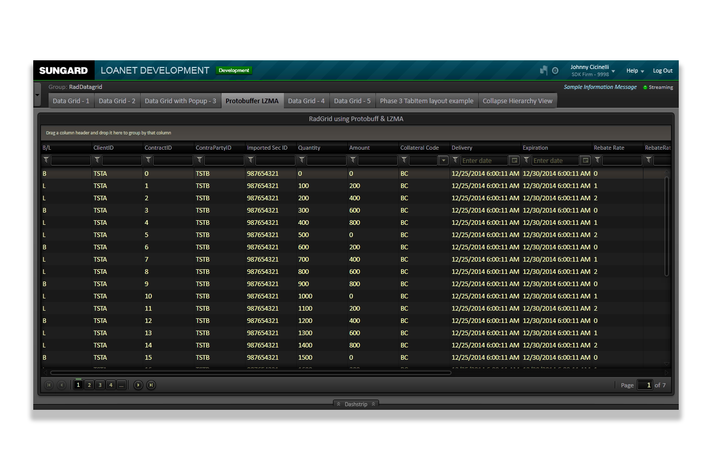
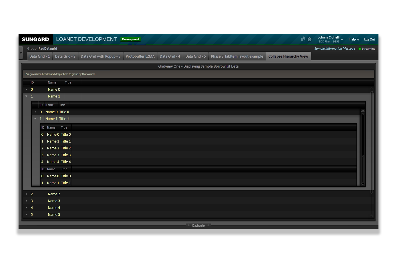
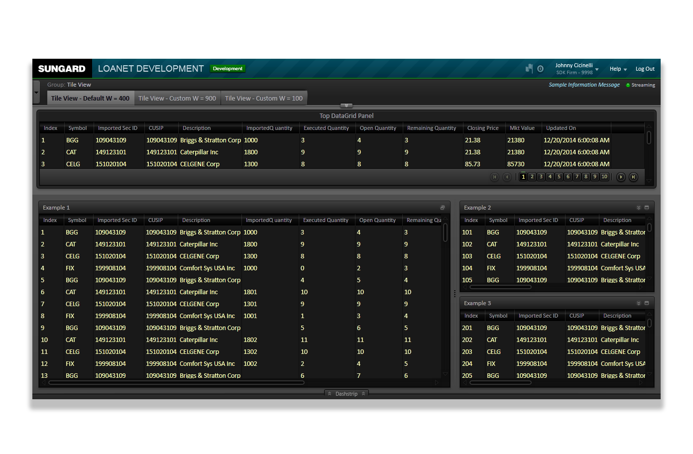
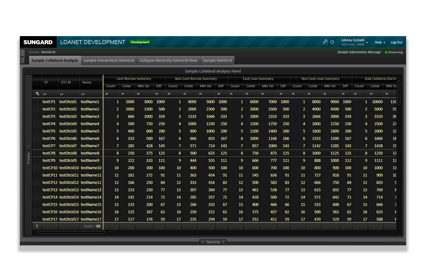
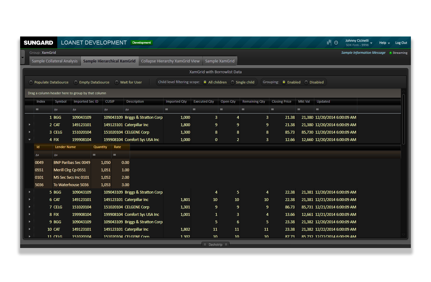
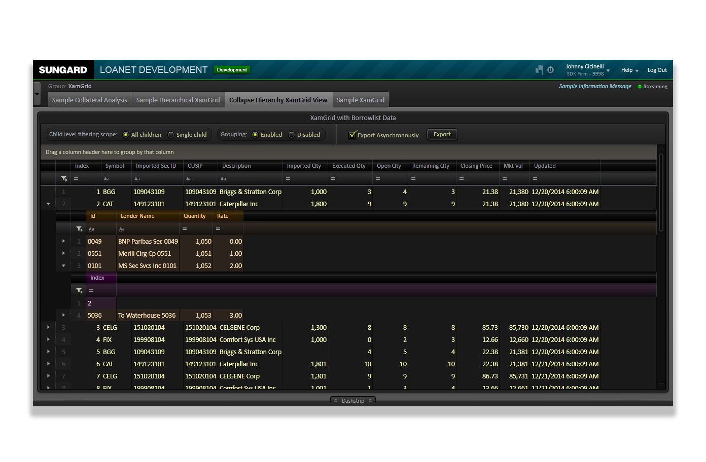
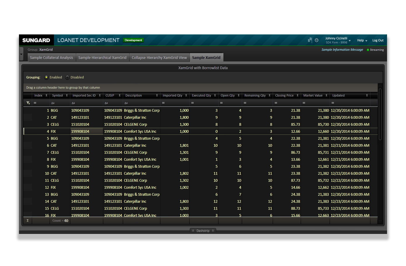
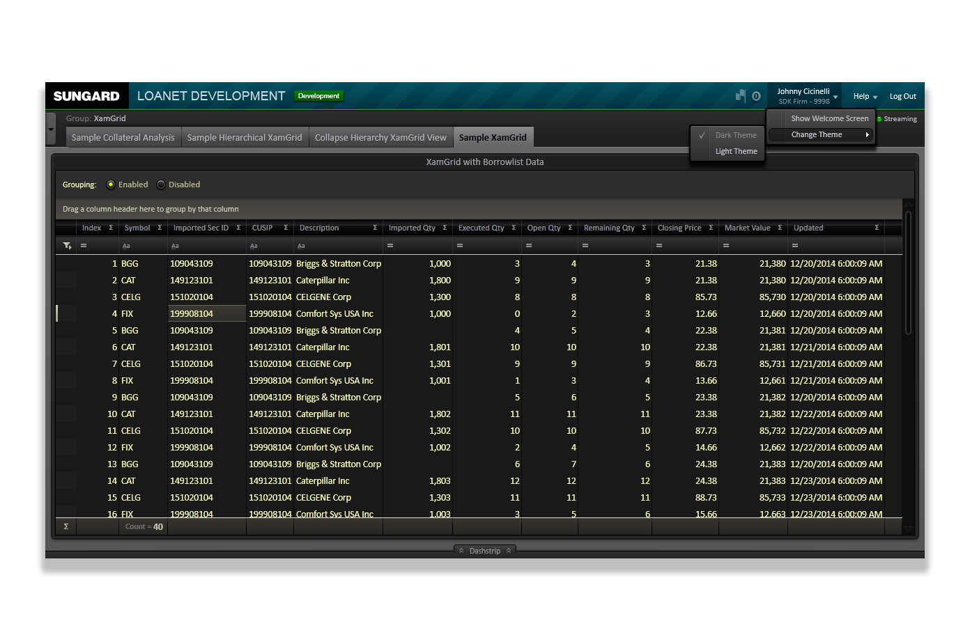
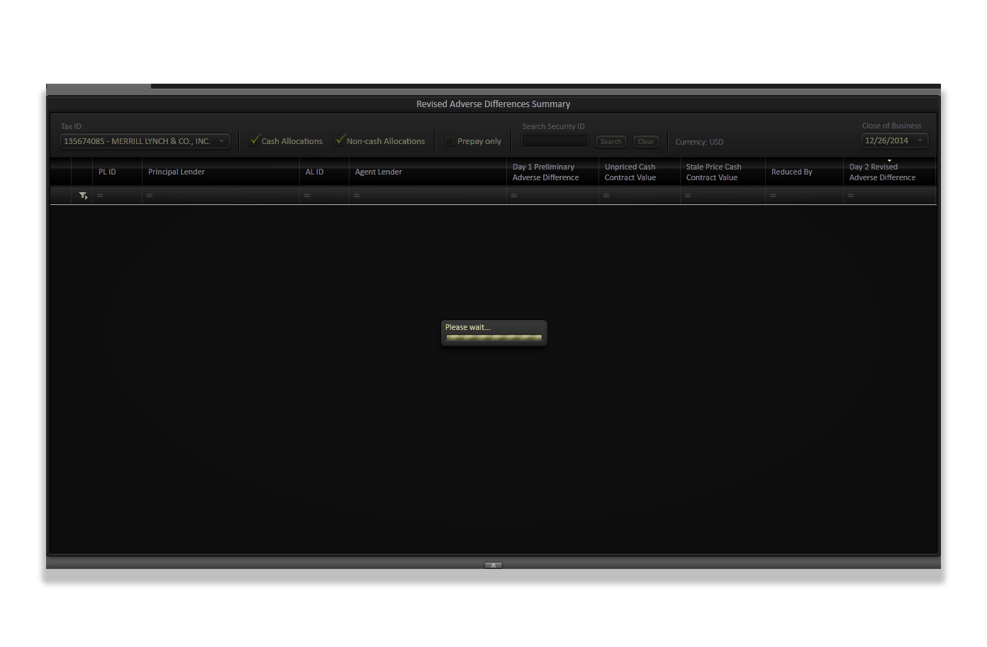
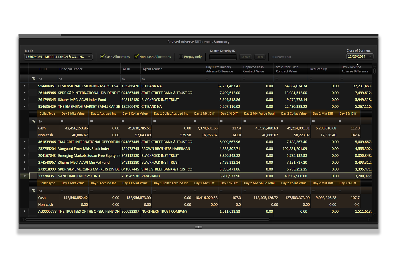
In addition to this, we also needed to adopt some 3rd-party controls from companies like Telerik and Infragistics, as they offered unique benefits with their versions of common controls. As an example, I had to learn to reconstruct the Data Grid controls from all three: Silverlight, Telerik, and Infragistics so that different modules could implement any one (or more) of them into their UI. I needed to make sure that the styling and interactions was nearly identical between them all.
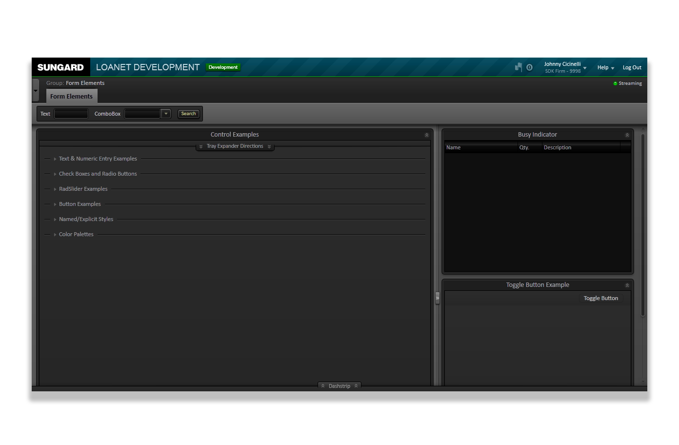
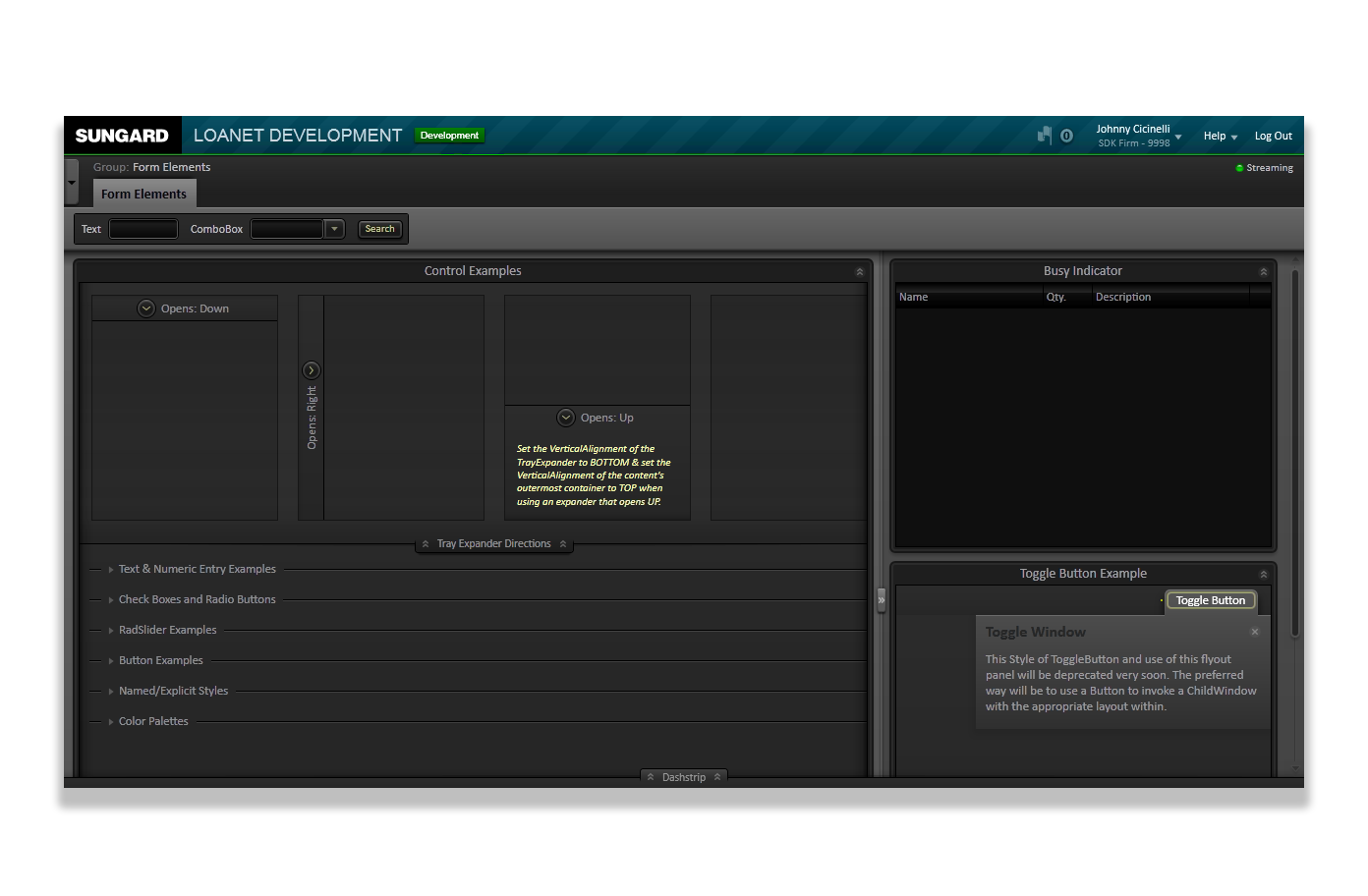
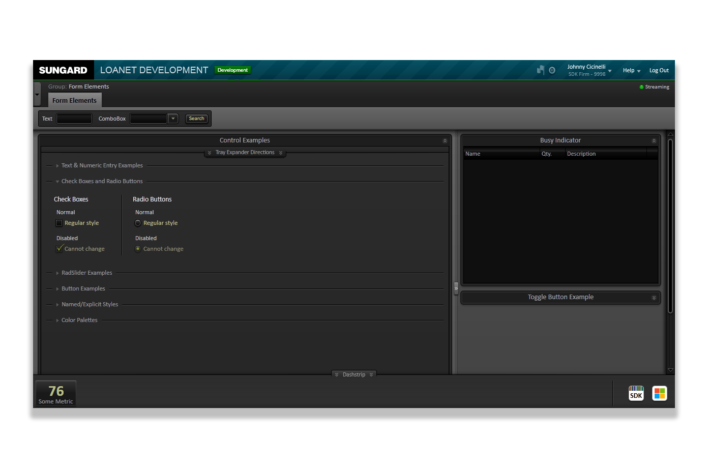
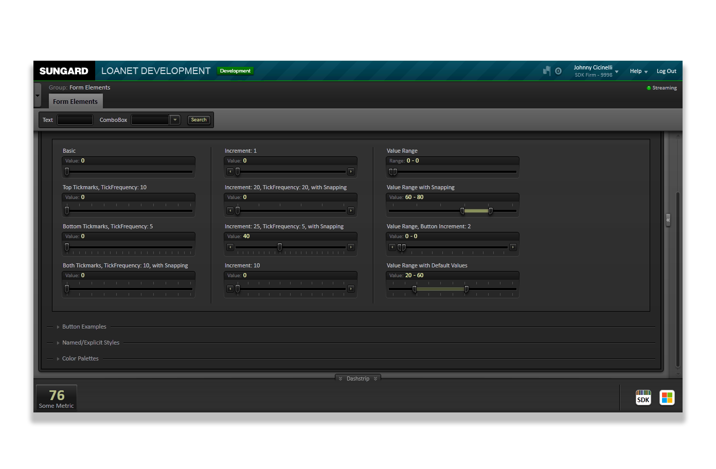
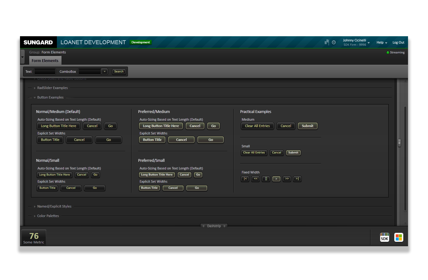
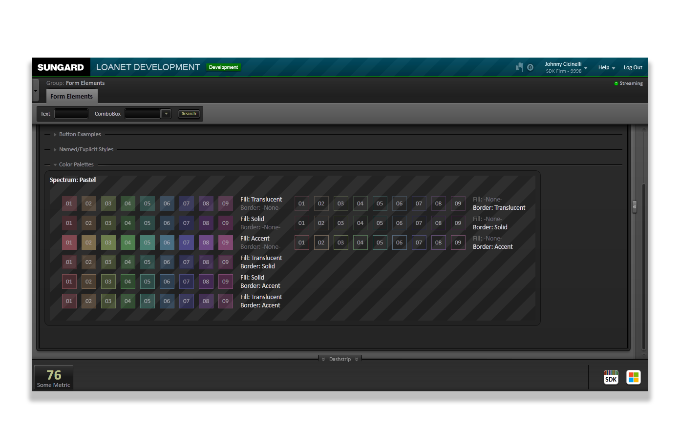
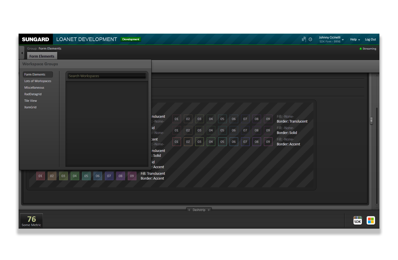
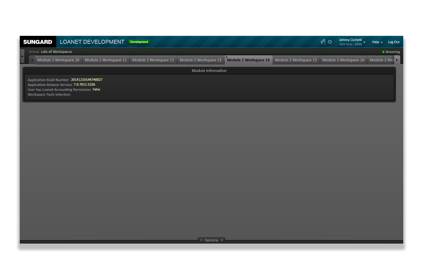
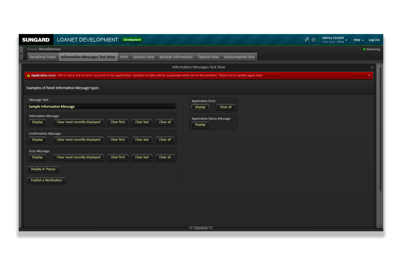
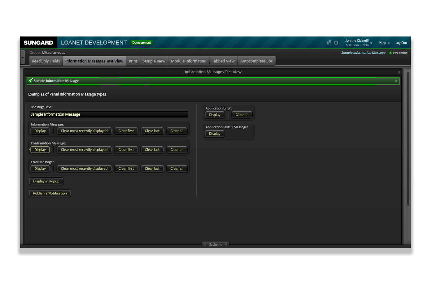
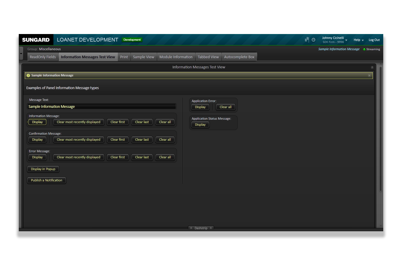
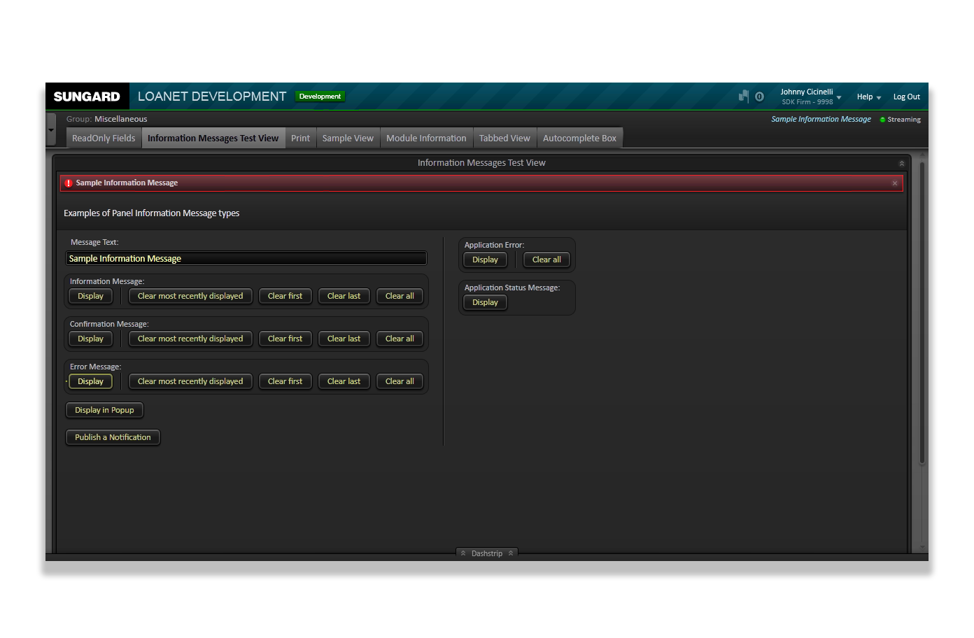
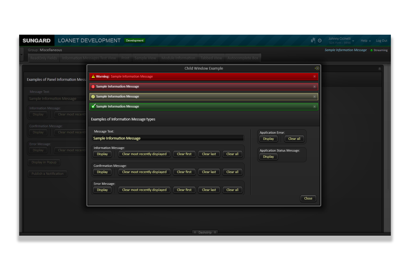
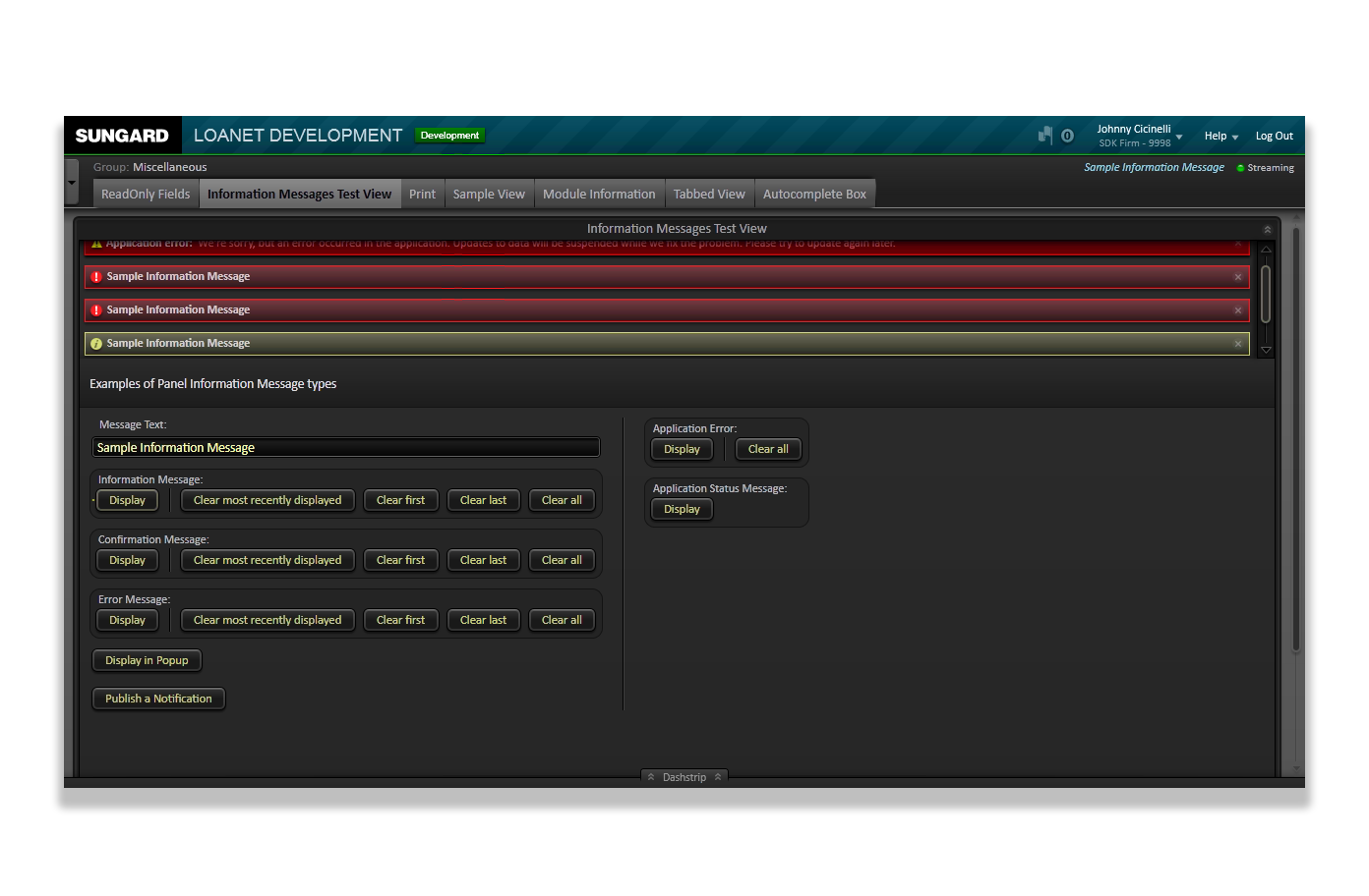
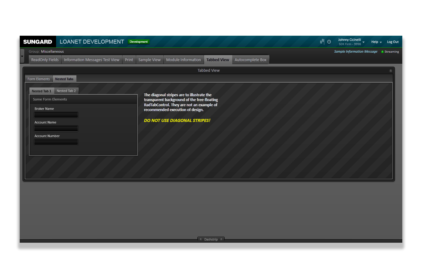
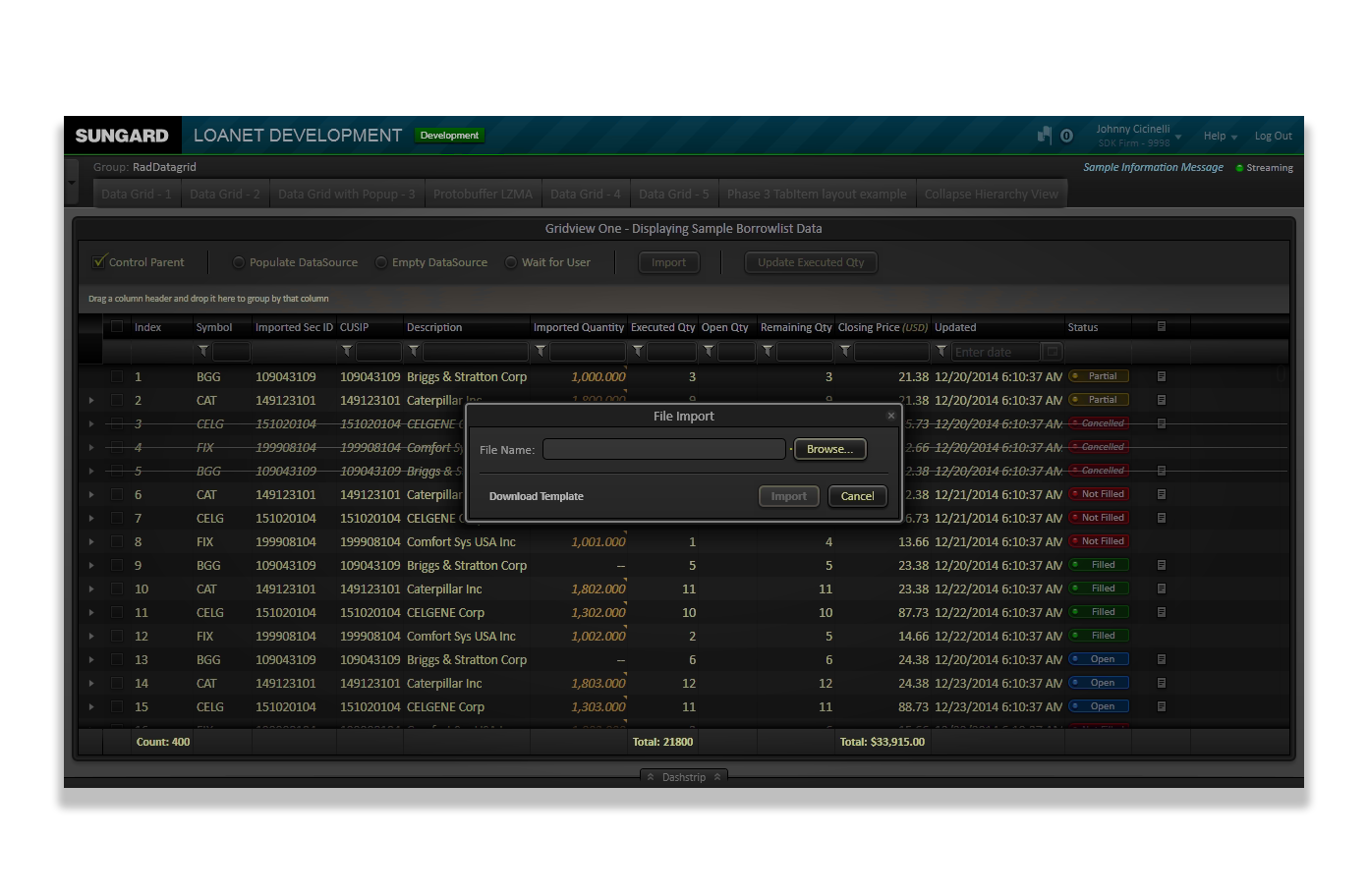
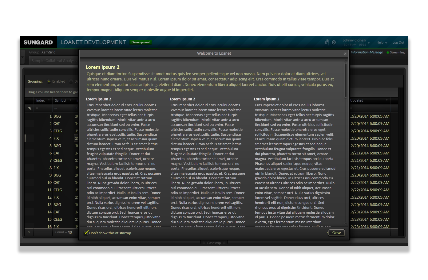
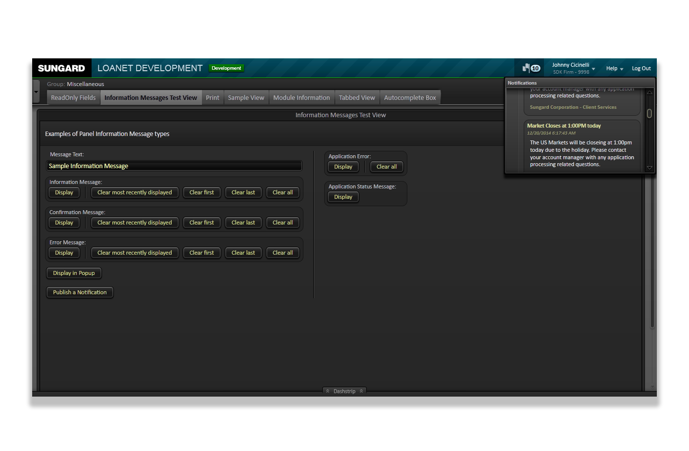
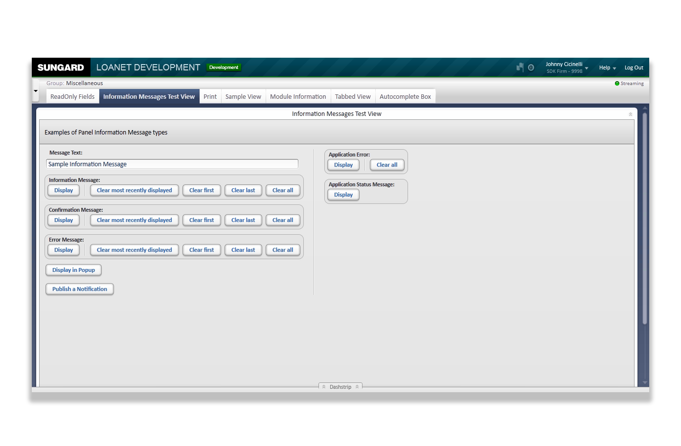
The screenshots below are not of implemented application or modual User Interfaces, but of the early work-in-progress state of the SDK's online Style Guide. Eventually, this would house patterns and UI/UX examples.
It had been decided prior to my involvment that although eventually the L2G interface would be able to toggle between a Light Theme and a Dark Theme, the initial efforts would focus on the Dark Theme. During this time, the then-CEO was enamoured with financial applications with dark-themed UIs, so that's where it began.
